


Python: Web App under 100 lines of code using Streamlit.
An interactive web app using Streamlit.


Less than 100 lines of code, I made a web app with just under 100 lines of code using Streamlit, Plotly and Pandas which is an open-source data analysis and manipulation tool, built on top of the Python programming language.
See the deployed app here
Well, if you are not aware of what is Streamlit then I will give you a quick idea about Streamlit.
Streamlit is an open-source app framework that allows you to create interactive and dynamic web apps without even knowing any frontend frameworks.
Let's get back to the topic, I am gonna walk you through the project so that you all can easily understand the code and hope to make a better web app by yourself.
Introduction
The web app is all about Exploratory Data Analysis and Visualization of Covid-19 data from India in the year 2020.
Well, I found the data on Kaggle. You can download any kind of dataset for free on Kaggle.
Let's get back to the track, we gonna have a nice interactive user interface with an interactive sidebar where we'll have some user inputs to select the type of graphs to visualize data.
Last but not least, we gonna display reports like which state has the highest cases or lowest cases, etc.
Now the talk is over, let's head over to the code. Let's get started.
1. Setting up project
First of all, make sure Python is installed on your system.
Now open up your favorite IDE or Code Editor and start an empty project.
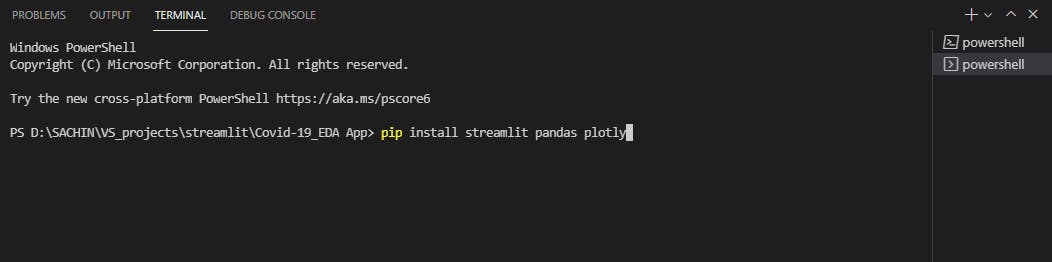
Make a directory and then fire the terminal in the code editor or IDE, then install the necessary libraries which are used in this project.
pip install streamlit pandas plotly
Now check if the streamlit is successfully installed on your system just run the following command in the terminal.
streamlit hello
If everything is well and good then head over to the next step.
2. Cloning the project
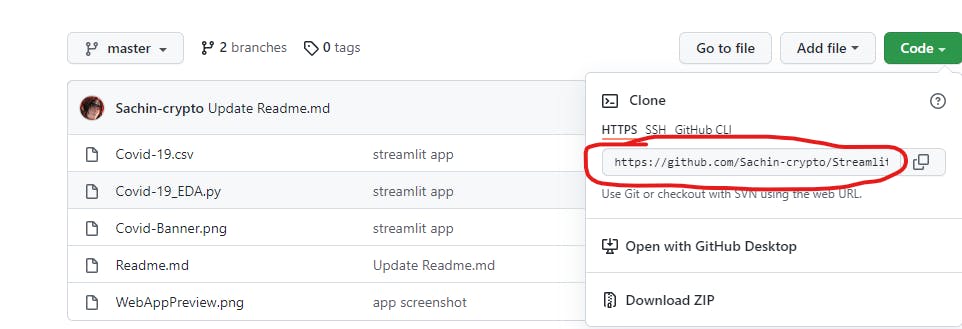
To clone the project head over to my Github profile and copy the repository URL.
Visit this repository to copy the URL and then run the following command in the terminal.
git clone repository_url_here
- note: make sure the git is installed on your system.
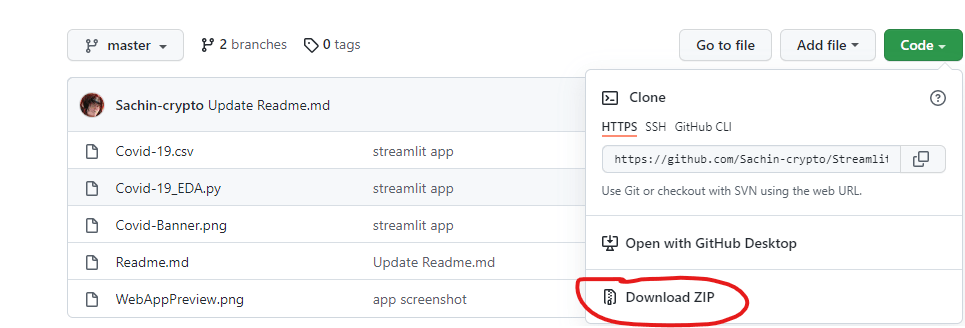
If you don't know git then don't worry, simply download the project as a ZIP file and extract it to the directory.
If every step is carried out successfully then proceed to the next step.
3. Understanding the code
Let's start by dividing code into smaller sections.
1. # Importing necessary libraries
2. import streamlit as st
3. import pandas as pd
4. import plotly.express as px
Line 1 - 4 -- Importing the libraries which are used in the project.
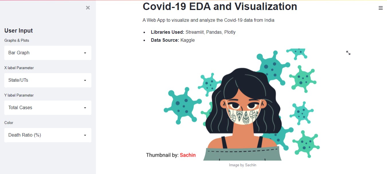
6. st.title("Covid-19 EDA and Visualization")
7.
8. st.markdown('''
9. A Web App to visualize and analyze the Covid-19 data from India
10. * **Libraries Used:** Streamlit, Pandas, Plotly
11. * **Data Source:** Kaggle
12. ''')
Line 6 - 12 -- By using streamlit's title and markdown feature, we are setting up the title and some description about the project.
13. # Inserting Image
14. st.image('Covid-Banner.png', caption="Image by Sachin")
15. # Reading csv data
16. data = pd.read_csv('Covid-19.csv')
17. # Displaying Data and its Shape
18. st.write("**Covid-19 dataset**", data)
19. st.write("Shape of data", data.shape)
Line 13 - 19 -- In that portion, we are inserting the banner image using streamlit's image feature and reading the Covid-19 data using Pandas library, and then finally displaying it on the web app.
20. # Header of sidebar
21. st.sidebar.header("User Input")
22. # Creating selectbox for Graphs & Plots
23. graphs = st.sidebar.selectbox("Graphs & Plots", ("Bar Graph", "Scatter Plot", "HeatMap", "Pie Chart"))
24. # Sorting the columns
25. index = sorted(data.columns.unique())
26. # Setting default value for x, y, and color
27. default_index_x = index.index('State/UTs')
28. default_index_y = index.index('Total Cases')
29. default_index_col = index.index('Death Ratio (%)')
Line 20 - 29 -- Creating a sidebar and select boxes in which users can select different graphs and plots. Additionally sorting the columns and setting the default values for the x-axis, y-axis, and color parameters
32. # Creating selectbox for x, y and color label and setting default value
33. x_label = st.sidebar.selectbox("X label Parameter", index, index=default_index_x)
34. y_label = st.sidebar.selectbox("Y label Parameter", index, index=default_index_y)
35. col = st.sidebar.selectbox("Color", index, index=default_index_col)
Line 32 - 35 -- Now creating the select boxes for the x-axis, y-axis, and color labels using st.sidebar.selectbox and assigning the default values to them which we created just above.
38. st.markdown('''
39. ## **Visualization**
40. ''')
41. # function to plot graphs
42. def visualize_plotly(graph):
43.   if graph == "Bar Graph":
44.         st.write(graph)
45.         fig = px.bar(data, x=x_label, y=y_label, color=col)
46.
47.    elif graph == "Scatter Plot":
48.         st.write(graph)
49.         fig = px.scatter(data, x=x_label, y=y_label, color=col)
50.
51.    elif graph == "HeatMap":
52.        st.write(graph)
53.        fig = px.density_heatmap(data, x=x_label, y=y_label, nbinsx=20, nbinsy=20)
54.
55.    else:
56.        st.write(graph)
57.        fig = px.pie(data, values=x_label, names=data[y_label])
58.
59.    return fig
60.
61. figure = visualize_plotly(graphs)
62.
63. st.plotly_chart(figure)
Line 38 - 63 -- Setting a heading for visualization and creating a function to show different-different graphs. Here, I created a function visualize_plotly(graph) which takes graph and declared if-else conditions in which if the user will click on Bar Graph then it will visualize data on the bar graph and the same goes for other graphs also. Then creating a variable figure to call the function visualize_plotly() and passing the graphs variable from line 23.
Then using st.plotly_chart(figure) to display graphs.
65. st.markdown('''
66. ## **Report**
67. ''')
68. # Creating buttons to display reports
69. if st.button("Highest Cases"):
70.    st.header("Highest Cases in a State/UT")
71.    highest_cases = data[data['Total Cases'] == max(data['Total Cases'])]
72.    st.write(highest_cases)
73.
74. if st.button("Lowest Cases"):
75.    st.header("Lowest Cases in a State/UT")
76.    lowest_cases = data[data['Total Cases'] == min(data['Total Cases'])]
77.    st.write(lowest_cases)
78.
79. if st.button("Highest Active Cases"):
80.    st.header("Highest Active Cases in a State/UT")
81.    high_active_cases = data[data['Active'] == max(data['Active'])]
82.    st.write(high_active_cases)
83.
84. if st.button("Lowest Active Cases"):
85.    st.header("Lowest Active Cases in a State/UT")
86.    low_active_cases = data[data['Total Cases'] == min(data['Total Cases'])]
87.    st.write(low_active_cases)
88.
89.if st.button("Highest Death Ratio (%)"):
90.    st.header("Highest Death Ratio (%) in a State/UT")
91.    high_death = data[data['Death Ratio (%)'] == max(data['Death Ratio (%)'])]
92.    st.write(high_death)
93.
94. if st.button("Lowest Death Ratio (%)"):
95.    st.header("Lowest Death Ratio (%) in a State/UT")
96.    low_death = data[data['Death Ratio (%)'] == min(data['Death Ratio (%)'])]
97.    st.write(low_death)
Line 65 - 97 -- Creating a report section where we created buttons st.button using streamlit and displaying it on web app.
4. Run the script
Cool, we are at the end of this project. Now let's see how our web app looks like.
Run the following command in your terminal
streamlit run your_project_name
Conclusion
This web app is based on the older stats, you can try with a newer dataset on Covid-19.
It is a beginner-friendly project or intermediate level to some extent, but you can take it to an advanced level by adding different datasets or adding more graphs.
🏆Other articles you might be interested in if you liked this one
✅What is ABC of Python - Detailed guide on abstract base classes?
✅Displaying and Uploading images on the frontend using FastAPI.
✅What are __init__ and __call__ functions and what do they do?
✅Build APIs using the FastAPI web framework in Python.
✅Connect PostgreSQL database using psycopg2 in Python.
✅Tackle the shortage of data using data augmentation techniques.
✅Powerful one-liners in Python to boost the code.
That's all for now
Keep Coding✌✌